
April 28, 2025 at 03:12 PM
When it comes to email marketing, it’s not just what you say — it’s how you show it. Great content can get lost if your design doesn’t guide the reader’s eye properly. That’s where visual hierarchy comes in. Visual hierarchy is all about arranging elements in a way that naturally leads readers through your message — highlighting what’s most important and encouraging action. When done right, it makes your emails easier to read, more enjoyable to scan, and much more likely to convert.
Here’s why visual hierarchy matters in email design — and how you can use it to boost engagement.
Before your readers even process the words, they scan the layout. Within seconds, they decide whether to read, skim, or close your email. A clear, well-organized visual structure immediately tells them, “This is worth your time.”
Key takeaway:
Use size, color, contrast, and positioning to make your key messages pop at first glance.
Your email should have a clear headline — ideally right at the top — that sets expectations. Larger, bold fonts naturally draw the eye and signal importance.
Design tip:
Use a bigger font size (e.g., 24–32px) for your main headline, and make sure it’s short, benefit-driven, and easy to understand.
Example:
"Unlock 30% Off Your Next Order – This Weekend Only!"
Visual hierarchy ensures that not everything looks equally important (because it’s not!). Use different text styles to create layers:
Pro tip:
Limit yourself to 2–3 font sizes and weights per email to keep it clean and scannable.
Color isn’t just about brand aesthetics — it directs attention. Bright, bold colors should highlight CTAs (like buttons), while muted colors support background or secondary information.
Best practices:
Don’t be afraid of empty space! White space around elements actually increases comprehension by up to 20%, according to studies.
Quick tips:
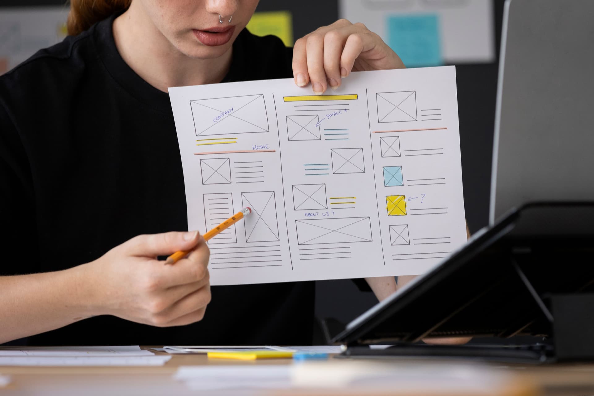
Images should enhance your message, not compete with it. A great visual hierarchy places images where they naturally support the story — without overwhelming the text.
Tips:
The goal of most emails? To get the reader to take action. Your Call to Action (CTA) should be visually prioritized — usually with a standout button above the fold and/or repeated at the end.
Best practices:
Since over 60% of emails are opened on mobile, your visual hierarchy needs to translate beautifully to small screens. That means:
Quick checklist:
Visual hierarchy isn’t about making emails “pretty” — it’s about making them work. It guides your reader’s attention naturally, keeps them engaged longer, and drives them to act.
Whether you’re sending a promo blast, a newsletter, or a product launch announcement, smart visual hierarchy ensures that your most important messages actually get seen (and clicked).
Want help designing high-converting emails with strategic layouts and visuals? We specialize in email design that not only looks great but drives real engagement. Let's chat!
Loading recent posts...